Sketching

Tuesday, August 18, 2009

Good pics for Project


Below are some images  that you can render using the one-point perspective
method we went over in class. Click on the image and print it out for your
reference.  The trick is to find a picture which shows the back wall
in a level, horizontal view, not at an angle.  Check it out.


You are not required to include every item in the photo in your drawing.  Streamline the 
design.  Look at the room like a designer and include the elements that clearly express the rooms color scheme and decor.


The couches above are pretty abstract and unusual. Emphasize the wood grain if you choose this image.


You can choose to include the figure or not.  Same goes for the toy cycle.  It's cute!


If you choose the image above, complete the couch.  If you are unsure how, look at some similar couches online or in magazines or from real life to complete the design.

Remember to start your drawing with the back wall and some element 
in the space for which you know the approximate dimensions like a couch or
door.  Start the drawing on grid paper in 1/4  scale.  


Above is another drawing. Do not use this as your reference image. 
This is for inspiration only. Fairly simple and straight forward with minimal
shading, but it works!


Monday, August 10, 2009

Project #5 field study (3 Drawings)


Your shop window is like a billboard for your store.  
They're a place to emphasize your unique identity, advertise merchandise and catch the attention of shoppers.


Following basic design principles will enhance your displays.


• Keep it clean.

• Change displays frequently to keep the look fresh.

• Bright lighting is crucial, both during the day and at night. Use lights to highlight individual items or signs. (Movable track lights work well.)

• Use repetition of shapes and colors to attract attention.

• Cluster items in groups of three or five. Odd numbers are most pleasing to the eye.

• Vary height and depth of items to carry the eye throughout the display. A pyramid or triangle is a pleasing shape.

• Use a sense of motion (pattern, line, implied line) to catch the customer's eye.

• Use light, bright colors.

• Continue the theme of the window display with other displays inside the store.


Project #5 Field Study-  will consist of 2 elevation sketches plus a floor plan of a shop of your choice. 

Objective:   After studying your chosen merchant, identify, analyze and illustrate in one floor plan and 2 elevations (one exterior with window display and one interior) the merchandising scheme in a new location.

Guidelines:  Conduct field research to find  examples of effective use of  visual merchandising in and around the Union Square shopping district.  Go inside a shop and use your best judgement as a designer to develop a sketch of the floor plan and one exterior elevation with entryway and windows plus one interior elevation that includes the cash wrap area. Use call-outs to identify elements of effective visual merchandising. 

Steps

1. Take to the streets to locate and sketch one merchant that is an example of exceptional  and exterior and interior visual merchandising. 

2. Make notes, thumbnail sketches of all important color schemes and design details.

3.  Make notes of all important architectural details.

4.  Come to class Tuesday August 20th prepared to colorize your 3 line drawings.  

5.  Include relevant call-outs on to support your decision.

6.  Submit all thumbnails and sketches with final drawings.

7.  Include at least one figure or mannequin in each elevation.

8.  Include a materials page that shows detail sketches of fixtures, floor treatment, color schemes, etc.

Tips:  Choosing to render the entire Macy’s department store is not recommended.  Some of the smaller shops, Seven, Anthropologie, Camper, Lucky Jeans, etc., will have displays that are more appropriate for this assignment.  


Points: 150

Due:  Line drawings with color scheme due 8/20

          Final Floor plan plus 2 Elevations (in color) with call-outs  plus figures due 8/28


Saturday, August 8, 2009

Assigment #4 Ideation Sketching


Ideation Sketching
Homework #4

Home plan and elevation Plus

Similar to your classroom plan and elevation assignment, measure a room in your home, such as the bathroom, living room or bedroom to create a floor plan and 2 elevation drawings.
Drawings should be in 1/2 or 1/4 scale depending on the room size. Sometimes very small rooms may be better illustrated in 1/2 scale. Make sure to note which scale you are using on the drawing.
Look at your room with your designer’s eye and include important elements like windows and entryways, furniture, floor and wall coverings, plants, window treatments, light fixtures, art, etc., but disregard the clutter.
Finally, add one or two new elements. You must include a resource image of the new elements taken from a magazine, design website or catalog. New elements may only include furniture or lighting fixtures.
Your final 3 drawings must include the new element(s) and be completed in color (marker with colored pencil accents) on marker paper. Remember to keep your line drawings on grid paper for reference and in case you wish to make changes.

100 points
Due 8/11

Tuesday, July 21, 2009

Project #2 Guidelines


Ideation Sketch

Project #1: Classroom Floor Plan & Elevation

Objective: Measure and draw the class room floor plan and two elevations in 1/4 inch scale
with fine point pen and marker.
Guidelines: In teams with tape measures, measure the class room and desks, seats, windows, closets, entryways. Convert measurements to 1/4 scale. Draft the drawings on graph paper without rulers. Color match in marker. Use shading when appropriate.
Points: 100

7/28


Monday, July 20, 2009

Some favorites


Marker Hint #1: To create a uniform square of color first use the fine-point end of your marker to lay down color along the inside edge of your square. Then switch to the wide end of your marker to completely fill in the square.

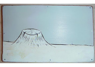
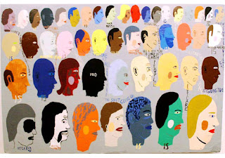
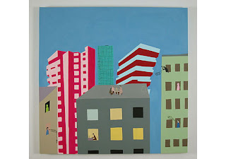
Here is some work by Barry McGee and below are two drawing/paintings by another one of my favorites Chris Johanson, both Bay Area natives.


There are a lot of different drawing styles and techniques. Drawing is like a language. We use it to communicate ideas. Everyone has their own unique voice. You just need to develop it.

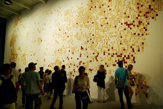
Emily Prince, All the American Servicemen and Women, 2004-ongoing.
She has been researching and drawing portraits of every serviceperson lost in the Wars in Iraq and Afghanistan. When the entire project is installed it is arranged to look like a map of the United States and each portrait is placed geographically.


Thanks for joining the class. Next week we will finish the first assignment and then draw and learn how to render different kinds of materials in marker and colored pencil.

SP

Classroom plan and elevations

Here are images of our classroom plan and elevations.
Please observe the placement of the drawings on the paper. try to make an interesting composition.
These drawings are not meant to be structural drawings. Leave that to the architect and the contractor. Our aim in this class is to produce sketches.


You are designers not engineers. For us it is more important to maintain proper proportions and scale.
Variations in measurements 1/2" to 1 1/2 " are an acceptable margin for error at this stage of the design process. Once a design is approved it must go through more rigorous analysis to be ultimately rendered in architectural drawings, which afford a much smaller margin of error.
Click on image for larger view


More about scale

Learning to read plans and elevations is a necessary skill for every designer. Let's try to tackle this scale concept again.


Drawing to scale can seem confusing but it’s fairly straight forward once you’ve learned the steps in the process. There is more than one way to convert real measurements to scale measurements.


One Way


Let’s say we have to draw a floor plan of a room measuring 26 feet by 31 1/2 feet.

We need to produce a drawing that will fit on a piece of paper that’s 8 1/2 by 11 inches.

If we were to calculate for 1/2” scale we would soon discover that drawing would not fit.

26’ equals 26 “ then divide by 2 for 1/2 scale would result in a 13” wall. Too big.

1/4” scale it is. 26’ = 26” divided by 4 = 6 1/2 inches.

The other wall would be 31.5’ = 31.5 “ divided by 4 = 7.875 “ (3/4” is the same as .75, .875 is just a smidge bigger, more like 7/8”). With a ruler on blank paper we would measure out those lengths and draft our room in 1/4 scale.


Another Way

If you have 1/4 inch square graph paper to do this operation stop once feet have been translated to inches and count those little squares. In this case every square equals one foot. 26 feet equals 26 squares!

To draw in 1/2 scale on 1/4 grid paper, every two little squares equates to one foot.

To draw in 1/1 scale, when one inch on your paper equals one foot in real life, count four little squares. This is ONLY if you have 1/4 graph paper (which was included in your class supplies).

There are many types of graph paper, some common types are 8 squares per inch, 10 squares or 5 squares per inch. If you needed to make a drawing in 1/10 scale, you may purchase 10 square grid paper, and then 1 little square equals 1 foot. This drawing would appear much smaller than on in 1/4 scale.

It is good to be proficient in both processes so you have a real understanding and can perform the operation without being dependent on this or that kind of paper.


The ability to draw to scale is an essential skill for every designer. The most elemental use for this skill is when a designer creates a idea sketch, on a napkin or scrap of paper. Very often, this sketch expresses all the energy of the designer's original idea. The design is perfect. The proportions are just right. By understanding how to draw to scale, a designer can translate a napkin sketch into real world measurements, draw a model and ultimately a full scale version of their design.

Original Sketch FreeShed w/addition, 2005. FreeShed at The Headlands Center for the Arts, 2006.

Followers