Thursday, February 12, 2009
Tuesday, February 3, 2009
PROJ 3

Ideation Sketching
Assignment #3
Part 1
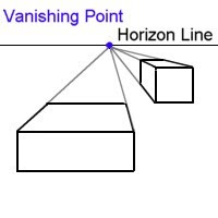
Perspective Value Study
A. Using 1-point perspective technique create a composition with 5-7 squares and rectangles
in varying sizes. Position forms above and below the vanishing point. Use a
ruler or folded piece of paper to draw construction lines (in pencil).
B. Then once you are satisfied with the composition, go over pencil lines with a fine-point
pen.
Color and Shade your drawing in Marker
C. Include a 4 step value scale in your composition. Steps are 10%, 30%, 60%, 90% cool grey.
D. Choose a light colored marker as your local color. (If you feel up to the challenge
you may use more than one light color. See example below.) Fill cubes completely with local
color, then proceed to shade.
Tips:
Start your drawing on grid paper, then transfer to marker paper.
Your vanishing point is the single light source that will dictate your shading pattern.
Horizontal planes nearest to the light source will be brightest.
Make several copies of your pencil drawing prior to coloring and shading.
Map out your shading pattern before inking.
Finally, make adjustments, more grey, some white pencil, to fine tune
your composition.
see project example below
Part 2
Thumbnails for home plan and elevation project
Examine one room in your home. Take measurements, notes and make a series of
thumbnail (6-8 small) sketches describing the general layout of that room including furniture,
wall and floor treatments, color scheme and material details.
Your notes and thumbnails must provide enough information so that you can render finished
drawings in class, including one floor plan and two elevations.
Thumbnail sketches should be done in pencil. Provide color swatches illustrating color
scheme.
Due 2/9
100 points

Monday, February 2, 2009
Reading Project #5
Project #5 Reading
Visual Merchandising Tips
Retail visual merchandising shares many of the same principles as advertising, graphic
design, and interior design -- the purpose of visual merchandising is to create a logical
and visually pleasing environment that will grab attention and translate into increased
sales. Visual merchandising basics are pretty easy to understand - a clean store, well lit,
with merchandise displayed in neat groupings. But as an industry, visual merchandising
delves a lot deeper, focusing on the psychology and motivations of the target customer.
The following are the top five tips for retail visual merchandising:
1. Entice - Visual merchandising actually starts on the street outside the store. Creative
and interesting window displays will catch the eye of people walking by and will draw
them into the store. Many store owners make the mistake of cramming in lots of merchandise (to indicate the variety of items they might carry,) but the most successful window designs create a theme, mood, or "lifestyle" that piques curiosity. Change the window
displays with the seasons, and always reflect your newest or best-selling items.
2. Impact - We've all done it - you walk into a store, take a lap around, and leave.
Maybe you were "just looking" -- more than likely, though, something about the store or
the merchandise displays turned you off. The experience of visiting an establishment
should be as rich as is appropriate -- any prospective customer should be able to walk
in and feel respected and comfortable. Whether it's music, product displays, lighting, or
even the climate control, everything in the store can impact the shopping experience.
3. Inspire - Create product displays that will show the customer how an item might fit
into their everyday life. In a home store, that might mean a sofa-chair grouping or a
complete table setting. In a clothing store it might mean dressing mannequins -- whatever
the store type, customers are more likely to purchase if they can imagine themselves
using/wearing the product.
4. Identify - These days, many shoppers are busy people. Perhaps they're popping in on
the way home from work, or on the way to the party -- whatever the case may be, shoppers
are more likely to purchase if they can find what they are looking for, easily identify
the price, and then find the register and check out. Product should be organized in logical
groupings -- whether by item type, color, or some other characteristic, and signage
and product descriptions should be clear and easy to read.
5. Add-on - Point-of-sale add-ons (also known as "impulse buys") can generate extra
dollars in sales. Think of small items that people usually forget -- batteries, light bulbs,
gift wrapping, etc -- these small items can be placed near or at the register as a gentle
reminder to the customer.
Creative window displays are an ideal way to set your business apart from the
competition. Windows are the billboard of your store, according to Tony Camilletti, of
store-design firm JGA Inc. They're a place to emphasize your unique identity, advertise
merchandise and catch the attention of shoppers.
So how do you make a traffic-stopping display? The possible subjects are endless, but
the key is to focus on a product or theme, not simply exhibit a collection of items.
Following basic design principles will enhance your displays. Here's some advice from
professionals like Camilletti, Denise Schroeder of Image Accomplice, and freelance
window dresser Kim Slocum from Pinckney:• Keep it simple. Don't try to put in everything
at once.
• Keep it clean.
• Change displays frequently to keep the look fresh.
• Bright lighting is crucial, both during the day and at night. Use lights to highlight individual
items or signs. (Movable track lights work well.)
• Use repetition of shapes and colors to attract attention.
• Cluster items in groups of three or five. Odd numbers are most pleasing to the eye.
• Vary height and depth of items to carry the eye throughout the display. A pyramid or
triangle is a pleasing shape.
• Use a sense of motion (pattern, line, implied line) to catch the customer's eye.
• Use light, bright colors.
• Continue the theme of the window display with other displays inside the store.
Sunday, January 25, 2009
Homework # 2 Guidelines


Monday, December 8, 2008
Final Project: Shop design
Final Project Ideation Sketch
Store Design
For your final project design a shop (apparel or home product) within the confines of the given building. Develop exterior and interior details based on research and resource material.
Project Requirements:
A. 5 Drawings: 1 exterior elevation with entryway, signage, windows, architectural details and materials, 2 interior elevations (one lower level, one upper level) with wall treatment, fixture, merchandise details, 2 floor plans with fixtures, cash wrap, floor treatment. See rough drawings for dimensions and basic design. Warning: Drawing not to scale. You MUST include 2 figures for scale (mannequins or people), and relevant call-outs.
B. 1 Mood/Inspiration page that includes at least 2 retail shop inspiration images, merchandise samples, images of fixtures and furniture employed in design, additional images related to mood/style/ inspiration.
C. Designer’s statement describing your design process, influences and effectiveness. This is your pitch to the client. Promote your vision.
All Drawings in 1/4 scale, on 8 1/2 by 11 inch paper.
The Scenario: A potential client has approached you to redesign a storefront on a walking-street in a recently gentrified neighborhood. The client wants you to design an artful store that sells apparel or home products. The demographic is 18-35 year olds, college educated, young professionals, artists and craftspeople.
You must decide (and describe in your essay) whether the store is a one-off, unique boutique or part of a chain. Be very specific about the merchandise. Is it mass produced, handmade, unique or limited? Provide inspiration images of merchandise. Base all of your decision on research. Collect images your influences and include them in your Mood page.
200 points
Due 12/15/08


Saturday, October 25, 2008
Monday: Shading and Perspective

Monday, October 20, 2008
Project #3 Guidelines
sample project #2Objective: Continue to gain knowledge of drawing with proper scale and proportion, color matching, and representing spacial relationships efficiently and accurately.
Guidelines: Choose one room in your home to represent in one floor plan and 2 elevation drawings in marker.
Begin your drawings on grid paper, then ink and transfer to marker paper. This can be done manually or on a copier (the one in the library is good for this). Home printers are not recommended since the ink may bleed when markers are applied. Always retain an original line drawing for your records and future corrections.
All items must be represented in 1/4 or 1/2 scale dependent on room size. If it’s a very large room, draw in 1/4 inch scale. Leave a border of clean paper around your drawing. This makes for a more focused composition. Include entry ways, windows, closet, furniture, light fixtures.
Color match your drawings.
Projects will be assessed on effective use of shading, overlapping and contrast to convey depth and spacial relationships in addition to presentation.
Remember to include a cover page with your drawings.
Points: 100 (one plan, 2 elevations)
Due: 11/3/08