Monday, March 2, 2009

Art Deco Project Guidelines


The last project involves researching the Art Deco era and creating a unique jewelry store that reflects your research and effective merchandising techniques.


Project #6


Guidelines: Conduct research  to answer the following questions about Art Deco Design.
The questionnaire is due 3/9.

1. During What years was the Art Deco design movement prominent?

2. Name 2 major socio-political events during or leading up to the Art Deco era.

3. Identify 2 major artists/designers of the Art Deco era and describe their activities and influence.

4. Identify 6 distinctly Art Deco characteristics relevant to architecture, art and fashion.
Example: elongated, jewel-toned...etc.

5. Identify 2 major architectural works of the Art Deco era.

6. What materials were commonly used in architecture, Art and Fashion (this includes jewelry, sculpture, ceramics and other artisan and fine art objects) during that time.

7. What were some popular colors and color schemes of the Art Deco era?

Be prepared to discuss your research in class.

After conducting research and discussing the content and context of Art Deco design, develop 4 distinct concepts for your jewelry store based on research. Each concept must include the following:

Part 1 Due 3/9

1. Exterior facade (the measurements for the front facade are not to exceed 30 feet wide and 24 feet tall)
2. 2 window displays
3. Floor Plan (measurements not to exceed 30 feet wide, 30 feet deep)
4. Color schemes
5. 4 inspiration images of architecture, furniture, textiles, floor and/or wall treatments (4 elements).


Part 2 Due 3/23

1. one exterior elevation
2. one interior elevation
3. one floor plan
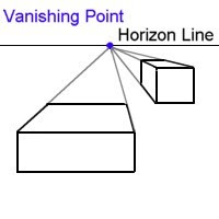
5. at least one figure to illustrate scale in each elevation
4. one materials page showing detailed sketches of furniture, fixtures, textiles, wall and or floor treatments (4 elements) from interior or exterior expressing Art Deco design.
5. One page essay describing the effectiveness of your merchandising display.
6.  Include a inspiration page, a collage of images that propelled your design process.


200 points Due 3/24   


Notice the jewel-toned color scheme


and the elongated forms.


Geometric patterns were popular in interior design


and architecture.


Sunday, March 1, 2009

Demo: Drawing from reference material


First, look at the image for information you can use. Look for items which will help you gain knowledge of scale. The couch against the wall is probably around 8 feet long. I will use this informtion to start to draw in 1/4 scale on gird paper. Then I measure the rest of the room in relation to the couch, keeping in mind that as objects get closer to the viewer they will grow larger.


Once I have the basic shape of the room I look for the "vanishing point" by following the horizontal lines in the room that recede toward the center. Once I have located the vanishing point I can make more accurate drawings of the furniture, walls and fixtures. Keep looking at the spacial relationships and adjusting the pencil drawing until it looks right. If you wish, use lines to block out shaded areas.


Transfer the drawing to marker paper manually or through a xerox copier.


Consult your original photo/image to determine your color scheme.


Be prepared to make some mistakes coloring. Have an extra copy of your line drawing ready for your second draft.
Personally, the lines on the blue wall don't work for me. In a second draft I would use only marker on the walls
or use lines more in an all-over way. They look out of place.

Marker Rendering and Project #4


Refer to classroom plan and elevations for guidance.  No perspective necessary 
but use overlapping, contrast, value, and shading to communicate spacial relationships.

Recall in class demonstration to colorize your drawings.


1. Determine a light source and the location of highlights and shadows. Leave the only the highest highlights blank.
2. Ink your drawings with fine-point pen on marker paper.
3. Consult your color chart and select your markers. Practice color mixing on scrap paper.
Determine the base color, most common color, preferably the lightest. Fill it in.
4. Working light to dark, colorize your project.
5. Add shadows using your grays, 10, 30, 60. Make sure to have at least three distinct values. Value creates form.
6. Use your white pencil to create highest highlights.


Project #4

Interior Reference Drawings

Objective:  Further develop knowledge of drawing with proper scale and proportion, color, material matching, and representing spacial relationships efficiently and accurately.

Guidelines:  

1.  Utilize class time to go to Library and find 3 images of residential interiors suitable for drawing one plan and two elevations.  After returning to class consult fellow students and instructor for final approval.  Images best suited for the project provide a clear, expansive view of at least one wall.  Cluttered images or images to deeply set into a corner do not provide enough information for the floor plan & elevations. 

2. Based on your best judgement, draw a floor plan of the room, or portion of the room shown in the image.  Research standard door, window, seating, table sizes to devise an accurate estimate of the interior space and elements contained within.  Color match all elements, floor, furniture, fixtures.

3. The elevation is an idea sketch based on the image.  It should have a sense of depth and perspective.  Try making several quick sketches to develop proper proportions, then pick your best to copy and color match.

4. Thirdly, create a materials page depicting 4 details in increased scale.  Material details could include fabric swatches, furniture, fixtures, floor and/or wall treatments. Include call-outs (notes identifying describing the material shown).

Be sure to provide enough detail in all your drawings to describe forms and materials accurately.  Is it a rectangle or is it actually a couch.  What is the couch made of?  Fabric, leather.  Is the floor painted concrete or walnut?  

All elements must be in proper proportion and relative scale.  DO NOT fill the entire paper with your drawing.  Create an organized, balanced and attractive composition.

Points 150

Due 11/10/08


Here are some good examples of appropriate images for this project.


Notice how there is enough information so that you can devise a possible floor plan and an elevation.  Also there is enough variety in texture, contrast,
color and value to create an attractive composition.

Below are more images to guide you through the project, some student work, some drawings by artists and professional designers.


Cool collage elevation composition by Rinah Lang for Dwell Mag
Elevations by students and instructors.


Student illustration of Material Details portion of project #4.

Thursday, February 12, 2009

Coming Soon Proj 4

check back soon for project examples.

Tuesday, February 3, 2009

PROJ 3


Ideation Sketching

Assignment #3

Part 1


Perspective Value Study

A. Using 1-point perspective technique create a composition with 5-7 squares and rectangles

in varying sizes. Position forms above and below the vanishing point. Use a

ruler or folded piece of paper to draw construction lines (in pencil).

B. Then once you are satisfied with the composition, go over pencil lines with a fine-point

pen.


Color and Shade your drawing in Marker

C. Include a 4 step value scale in your composition. Steps are 10%, 30%, 60%, 90% cool grey.

D. Choose a light colored marker as your local color. (If you feel up to the challenge

you may use more than one light color.  See example below.) Fill cubes completely with local

color, then proceed to shade.


Tips:

Start your drawing on grid paper, then transfer to marker paper.

Your vanishing point is the single light source that will dictate your shading pattern.

Horizontal planes nearest to the light source will be brightest.

Make several copies of your pencil drawing prior to coloring and shading.

Map out your shading pattern before inking.

Finally, make adjustments, more grey, some white pencil, to fine tune

your composition.


see project example below


Part 2

Thumbnails for home plan and elevation project

Examine one room in your home. Take measurements, notes and make a series of

thumbnail (6-8 small) sketches describing the general layout of that room including furniture,

wall and floor treatments, color scheme and material details.

Your notes and thumbnails must provide enough information so that you can render finished

drawings in class, including one floor plan and two elevations.

Thumbnail sketches should be done in pencil. Provide color swatches illustrating color

scheme.

Due 2/9

100 points


Monday, February 2, 2009

Reading Project #5

Project #5 Reading

Visual Merchandising Tips


Retail visual merchandising shares many of the same principles as advertising, graphic

design, and interior design -- the purpose of visual merchandising is to create a logical

and visually pleasing environment that will grab attention and translate into increased

sales. Visual merchandising basics are pretty easy to understand - a clean store, well lit,

with merchandise displayed in neat groupings. But as an industry, visual merchandising

delves a lot deeper, focusing on the psychology and motivations of the target customer.

The following are the top five tips for retail visual merchandising:


1. Entice - Visual merchandising actually starts on the street outside the store. Creative

and interesting window displays will catch the eye of people walking by and will draw

them into the store. Many store owners make the mistake of cramming in lots of merchandise (to indicate the variety of items they might carry,) but the most successful window designs create a theme, mood, or "lifestyle" that piques curiosity. Change the window

displays with the seasons, and always reflect your newest or best-selling items.


2. Impact - We've all done it - you walk into a store, take a lap around, and leave.

Maybe you were "just looking" -- more than likely, though, something about the store or

the merchandise displays turned you off. The experience of visiting an establishment

should be as rich as is appropriate -- any prospective customer should be able to walk

in and feel respected and comfortable. Whether it's music, product displays, lighting, or

even the climate control, everything in the store can impact the shopping experience.


3. Inspire - Create product displays that will show the customer how an item might fit

into their everyday life. In a home store, that might mean a sofa-chair grouping or a

complete table setting. In a clothing store it might mean dressing mannequins -- whatever

the store type, customers are more likely to purchase if they can imagine themselves

using/wearing the product.


4. Identify - These days, many shoppers are busy people. Perhaps they're popping in on

the way home from work, or on the way to the party -- whatever the case may be, shoppers

are more likely to purchase if they can find what they are looking for, easily identify

the price, and then find the register and check out. Product should be organized in logical

groupings -- whether by item type, color, or some other characteristic, and signage

and product descriptions should be clear and easy to read.


5. Add-on - Point-of-sale add-ons (also known as "impulse buys") can generate extra

dollars in sales. Think of small items that people usually forget -- batteries, light bulbs,

gift wrapping, etc -- these small items can be placed near or at the register as a gentle

reminder to the customer.


Creative window displays are an ideal way to set your business apart from the

competition. Windows are the billboard of your store, according to Tony Camilletti, of

store-design firm JGA Inc. They're a place to emphasize your unique identity, advertise

merchandise and catch the attention of shoppers.

So how do you make a traffic-stopping display? The possible subjects are endless, but

the key is to focus on a product or theme, not simply exhibit a collection of items.

Following basic design principles will enhance your displays. Here's some advice from

professionals like Camilletti, Denise Schroeder of Image Accomplice, and freelance

window dresser Kim Slocum from Pinckney:• Keep it simple. Don't try to put in everything

at once.


• Keep it clean.

• Change displays frequently to keep the look fresh.

• Bright lighting is crucial, both during the day and at night. Use lights to highlight individual

items or signs. (Movable track lights work well.)

• Use repetition of shapes and colors to attract attention.

• Cluster items in groups of three or five. Odd numbers are most pleasing to the eye.

• Vary height and depth of items to carry the eye throughout the display. A pyramid or

triangle is a pleasing shape.

• Use a sense of motion (pattern, line, implied line) to catch the customer's eye.

• Use light, bright colors.

• Continue the theme of the window display with other displays inside the store.

Sunday, January 25, 2009

Homework # 2 Guidelines

1350p2
Objective:  

To color match and render in marker 3 different material swatches and render three different examples of modern seating from reference material.

Choose 3 pieces of furniture from handouts. Visit  the library's Material Swatch room and find 3 swatches appropriate to your furniture. 

Draw your furniture and swatch in appropriate scale on graph paper first in pencil.  Once you are happy with the composition, go over pencil in fine-point marker, erase pencil, then color match swatch and color in the frontal elevation with appropriately scaled down swatch.

For example, if your chair is 3 feet tall, you should render it in 1"=1' scale so it is large enough.
If you are drawing a 8 foot couch however, rendering in 1/2 scale will be more appropriate so you have room in your layout to include both a side elevation, front elevation and a swatch of your material.

"Upholster" each piece of furniture with a different material swatch.  Be sure to scale down your material so that it is rendered in the same scale as your furniture. 

You must turn in 3 drawings.  On each page illustrate one front and one side elevation view per piece of furniture including fabric swatch and "upholstered" view.

Provide a photo copy of your material, furniture and attach to each drawing. 

Please study the sample image for layout.   Create a professional, attractive and balanced composition. Consider your layout carefully.  The entire paper is part of your project.   

Project Points:  100
Project Due:  2/03


Followers